Search Website
Content Editor (WYSIWYG)
The Content Editor (also called the WYSIWYG editor, meaning “What you see is what you get”) is where you format content inside components like Columns, Accordions, and Tabs.
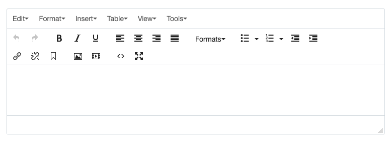
Even for a basic page (for example, a new Left Navigation page with a default one-column section), you can create clear, skimmable content using only the Content Editor (WYSIWYG)
To avoid layout issues and keep pages running smoothly, remove hidden formatting when pasting content from Word, Google Docs, emails, or other webpages.
Method 1: Paste without formatting in the WYSIWYG editor
- Windows:
Ctrl + Shift + V - Mac:
Cmd + Shift + V(may appear as “Paste and Match Style”)
Method 2: Paste into a plain-text app first
- Windows: Notepad
- Mac: TextEdit set to Plain Text
Then copy from there and paste into the WYSIWYG editor.
Method 3: If you already pasted and it looks messy
- In the WYSIWYG editor, highlight the affected text and click Format → Clear Formatting.
- Reapply headings, lists, and links using the toolbar (avoid using repeated Enter for spacing).
Headings help users scan and understand the page quickly. They can also improve search visibility by giving your content clear structure.
To apply a heading
- Highlight the text
- Click Format → Formats → Headings
- Select the heading level you need
Best practice: Keep headings in order (don’t jump from a main heading straight to a much smaller one).
Example headings
Heading 2
Heading 3
Heading 4
Bullets are best for lists of items, steps, or links
To apply list
Bullet List
- Highlight the text you want to list.
- Click the bullet list icon in the editor.
Numbered List
- Highlight the text you want to list.
- Click the numbered list icon in the editor.
Example bullet List
- Lorem ipsum dolor sit amet
- consectetur adipiscing elit
- Fusce consectetur orci vitae
Example numbered List
- Lorem ipsum dolor sit amet
- consectetur adipiscing elit
- Fusce consectetur orci vitae
Text links (basic)
Text links should be clear and descriptive—users should know what they’re clicking before they click it.
Internal vs external links
- Internal link: links to a page or file within Cascade (your site)
- External link: links to a site outside Cascade
External links should open in a new tab so users don’t lose their place on the Schulich site.
Chevron links (lists of links)
Chevron links are used when you want to present a clean list of links (for example: resources, quick links, related pages). They’re easier to scan than a paragraph of links.
Buttons are for actions, not for every link.
To apply Buttons
- Enter Button Text: Type in the button
- Add link: internal or external
- Choose a Button Style:
- For a single button, use the purple-button style.
- For a second button, use the white-button style.
Please note that our brand guidelines require you to use these specific styles when creating a pair of buttons, and you should not include more than two buttons together.
Watch video: How to add buttons
Example buttons
Create a Table
- Click Table and select the number of rows and columns you need.
- Drag the edges of the table to resize it, and add content to each cell as needed.
Format a Table
- Click on any cell within your table.
- Go to Format → Formats → Custom to see a list of available table styles, including:
- Table
- Bordered Table
- Table Without Borders
- Strip Row Table
- Strip Column Table
- Hoverable Table
- Apply the style that best fits your layout and design needs.
Align Cell Content
- Select the cell you want to adjust.
- Click Table → Cell Property, where you can set both horizontal and vertical alignment for the text or images inside that cell.
Watch video: How to add and style a table
Example table (Striped Rows table)
|
Proin ac justo suscipit
|
12,500
|
Proin ac justo suscipitProin ac justo suscipitProin ac justo suscipit |
Proin ac justo suscipit
|
|
Proin ac justo suscipit
|
17,900
|
Proin ac justo suscipit
|
Proin ac justo suscipit
Proin ac justo suscipit
|
|
Proin ac justo suscipit
|
12,500
|
Proin ac justo suscipit
|
Proin ac justo suscipit
Proin ac justo suscipit
|
You can insert images anywhere you have a WYSIWYG field (commonly Columns/Accordions/Tabs).
- Click the Image icon
- Choose Choose File
- Select your image from Recent (if just uploaded) or Browse → your img folder
Best practice:
- Prepare/crop images to the size required by the component/template
- Add meaningful alt text when the image conveys information